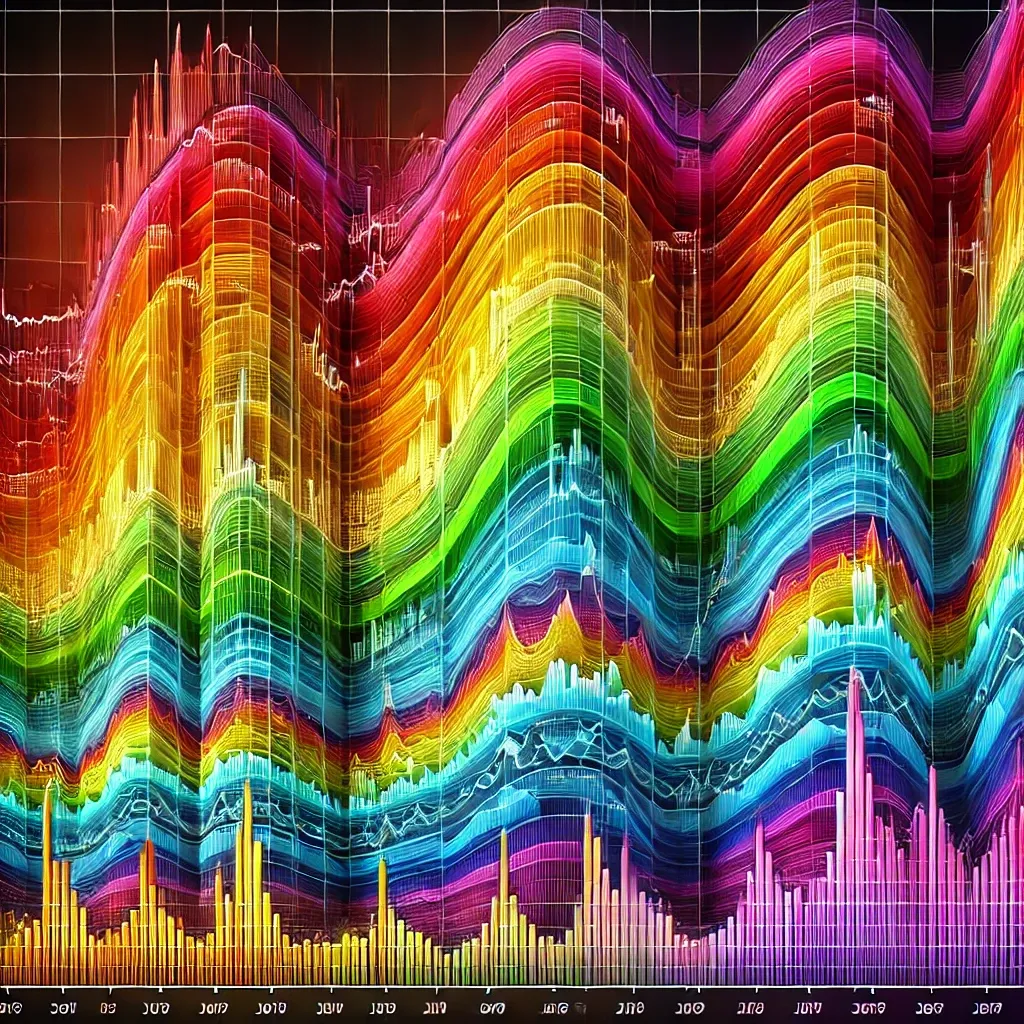
The Bitcoin Rainbow Chart is a popular visual tool among cryptocurrency enthusiasts, offering insights into the potential future price movements of Bitcoin. It is designed to help traders and investors understand the historical price trends of Bitcoin, predict future prices, and assess market cycles. The chart’s vibrant bands represent different stages of Bitcoin’s price trajectory, ranging from the “buy zone” at the lower end to the “sell zone” at the higher end.
What is the Bitcoin Rainbow Chart and how can it help predict Bitcoin prices? Explore its significance, variations, and live tracking tools in our comprehensive guide.
Bitcoin Rainbow Chart Explained
The Bitcoin Rainbow Chart is a unique price indicator that uses color-coded bands to depict the price movement of Bitcoin over time. The colors represent various stages of Bitcoin’s price, helping investors identify patterns that can signal whether Bitcoin is underpriced, overvalued, or approaching a critical market shift. The chart combines technical analysis and market psychology, making it an intuitive way to track Bitcoin’s long-term price trends.
Key Features of the Bitcoin Rainbow Chart:
- Color-Coded Bands: Each color represents a different price range. From red (overbought) to violet (undervalued), the colors serve as a simple visual guide.
- Historical Data: The chart overlays past Bitcoin price movements with these bands, helping to predict future price trends.
- Price Forecasting: While not a guarantee, the chart’s patterns can offer insights into where the Bitcoin price might head in the short to long term.
- Long-Term Trends: Unlike other charts, the Bitcoin Rainbow Chart focuses on long-term data and market cycles rather than short-term volatility.
- User-Friendly: Designed for both novice and expert traders, the Bitcoin Rainbow Chart simplifies complex market data into an easy-to-understand visual tool.
The chart is often displayed in TradingView, a popular platform for live tracking of Bitcoin and other cryptocurrencies. The color spectrum ranges from red (indicating a bubble or overbought market) to violet (indicating a potentially undervalued market). Traders often use the chart to time their buys and sells, aligning with the broader market trends.
👉 Explore Live Bitcoin Rainbow Chart 👈
Variations of the Bitcoin Rainbow Chart
The Bitcoin Rainbow Chart has evolved over time, with multiple versions created to improve its accuracy and usability. One of the most notable updates is the Bitcoin Rainbow Chart v2, which offers enhanced features such as real-time updates and more granular price zones.
Key Variations:
- Bitcoin Rainbow Chart v2: An updated version with more precise color bands and advanced features.
- Bitcoin Rainbow Chart 2025: A future-oriented version that projects Bitcoin prices as far as 2025 based on past trends.
- Bitcoin Rainbow Chart TradingView: The chart is available in real-time on TradingView, giving users up-to-the-minute updates.
- Bitcoin Rainbow Chart Blum: A version created by the prominent Bitcoin analyst, Adam Blum, which adapts the original chart for specific trading strategies.
- Bitcoin Rainbow Chart Indicator: This version can be integrated into various trading platforms as a technical indicator to assist with buy and sell decisions.
The Bitcoin Rainbow Chart v2 is increasingly popular among traders due to its ability to offer more precise price targets and allow for dynamic adjustments. It integrates feedback from a larger community of crypto traders, providing a more robust set of predictions.
👉 Track Real-Time Bitcoin Prices 👈
Bitcoin Rainbow Chart Price Forecasts
The Bitcoin Rainbow Chart is not only a historical tool but also a method for forecasting future price trends. By analyzing previous cycles and comparing them to the current market, the chart can help predict where Bitcoin’s price is headed over the next few years.
Key Points of Bitcoin Price Forecasting:
- Price Prediction for 2025: The Bitcoin Rainbow Chart shows a potential significant increase in Bitcoin’s value as it moves through its “green” to “yellow” zones, signaling a growth phase.
- Price Prediction for 2050: Long-term projections based on the chart suggest that Bitcoin could experience exponential growth, potentially reaching new all-time highs.
- Real-Time Updates: The live Bitcoin Rainbow Chart is crucial for spotting sudden market changes and reacting quickly to price fluctuations.
- Market Psychology: The chart captures the psychology of the market, reflecting collective buying and selling decisions that influence Bitcoin’s price.
- Technical Analysis: Using the rainbow bands as a technical indicator, traders can make more informed decisions about when to enter or exit the market.
The Bitcoin Rainbow Chart Price Forecast provides not just a glimpse into Bitcoin’s future but offers concrete price zones that help traders know when the cryptocurrency is in a strong buy or sell territory. While not a guaranteed predictor, it serves as a valuable tool for investors looking to navigate the volatile cryptocurrency market.
👉 Check Bitcoin Forecast Today 👈
Conclusion
The Bitcoin Rainbow Chart is a powerful tool that combines both historical data and technical analysis to help traders and investors understand Bitcoin’s price trends. With its color-coded bands, the chart simplifies the complexity of Bitcoin’s volatile market and provides a visual roadmap for long-term price predictions. Whether you’re using the Bitcoin Rainbow Chart for live tracking, forecasting Bitcoin’s price in 2025 or 2050, or simply navigating the market cycles, this tool offers a valuable perspective on the cryptocurrency landscape.As market cycles repeat themselves, understanding these patterns could give investors a critical edge. As the famous investor Warren Buffet once said, “The stock market is a device for transferring money from the impatient to the patient.” In the world of Bitcoin, patience, coupled with tools like the Rainbow Chart, could very well lead to profitable outcomes in the long run.


